Influences
Basing my ideas on the concept of Hilaire Belloc’s ‘Cautionary Verses’, has lead me to now adapt some of the valuable lessons I gathered with my survey into short, rhyming stories, teaching moral lessons. These will, in their own way, parody Belloc’s work. My thinking around the creation of these stories feels loose at present but I really enjoy writing in combination with simple illustrations as a means of storytelling.
I started with one of the shorter, and perhaps easier, lessons that was given as an answer to my survey – “I learnt to tell the time.” I felt this came with obvious reasoning into why it’s an important lesson to learn, and would give more room for a comedic, or Victorian parody, writing style. I’m keen to make my ‘Valuable Lessons for Valued Living”, modern in their setting, but with wording similar to that used by Belloc in 1907.
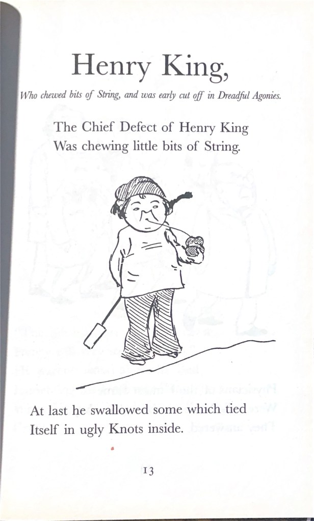
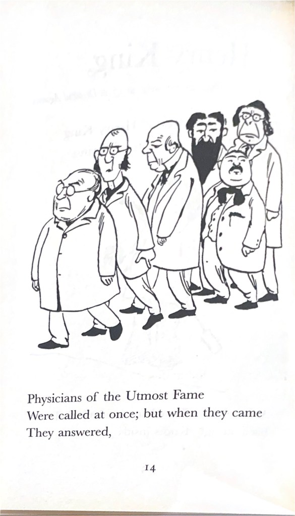
The original illustrations by B.T.B are sketch-like, ink drawings, not dissimilar to the simplistic, characterful drawings by Quentin Blake that have been added in later editions of the book. I wanted to add my own, simple drawings to my poem, and decided they would be best suited to black ink only, to fit in with older printing styles, and to avoid over-complicating the work in the time I have left on this project. I’m not very confident when it comes to drawing without a reference. I can be very self-critical about my own work, particularly if it’s a quick doodle or cartoon drawing.
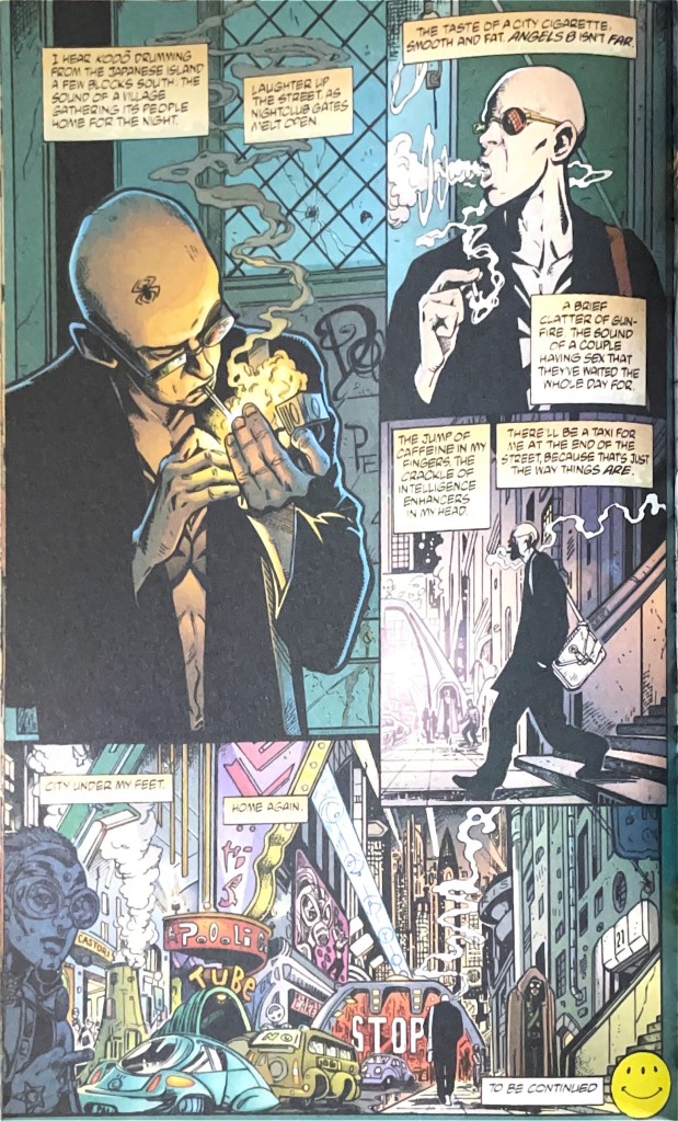
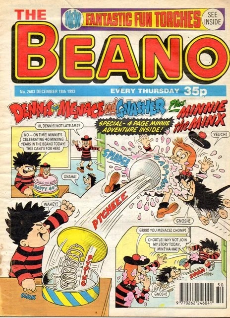
I grew up reading and looking at comics, and so I am familiar with a range of different graphic novel artists’ styles. My favourites range from highly detailed drawings from graphic novels such as ‘Transmetropolitan’, written by Warren Ellis and drawn by Darrick Robertson; to comic strips from early editions of The Beano – where the drawings are much more pared down, and less detailed. Typically, in my own approach to comic, or graphic novel, drawings I work simply; adding detail where it feels most necessary – a popular storytelling device often used in Manga comics to highlight things of significance.
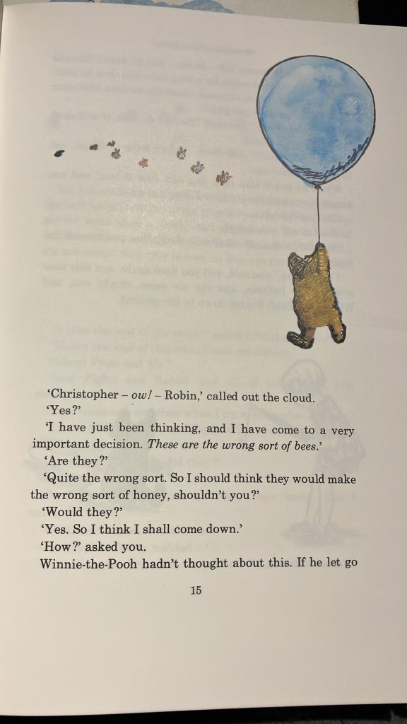
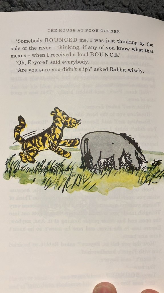
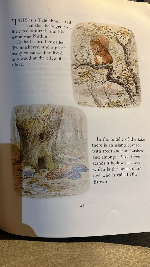
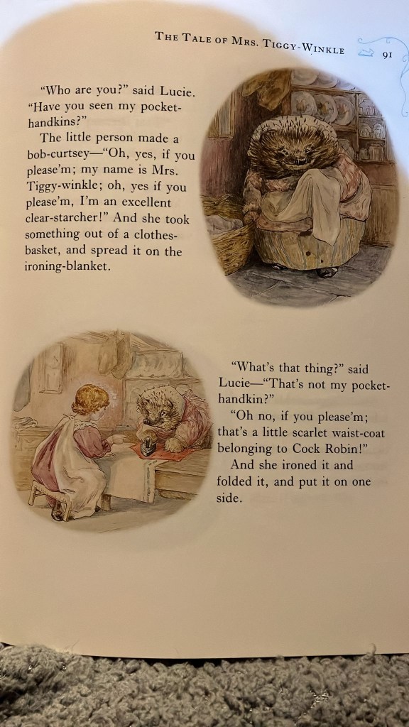
For this piece, I want the designs to remain simple and not detract from the words they accompany. I’m making this choice partly based on my own lack of confidence with drawing, and also based on my research and the types of illustrations that often accompany verse, or stories for children. My references include the original ‘Cautionary Verses’ as illustrated by B.T.B, as well as more recent Quentin Blake additions. I’m also basing some of my references on the sketches of Beatrix Potter, and E.H Shepard (the latter illustrated the original ‘Winnie-the-Pooh’ stories) as these were books I loved to look over as a child.
19/11/2025 – Research Trip
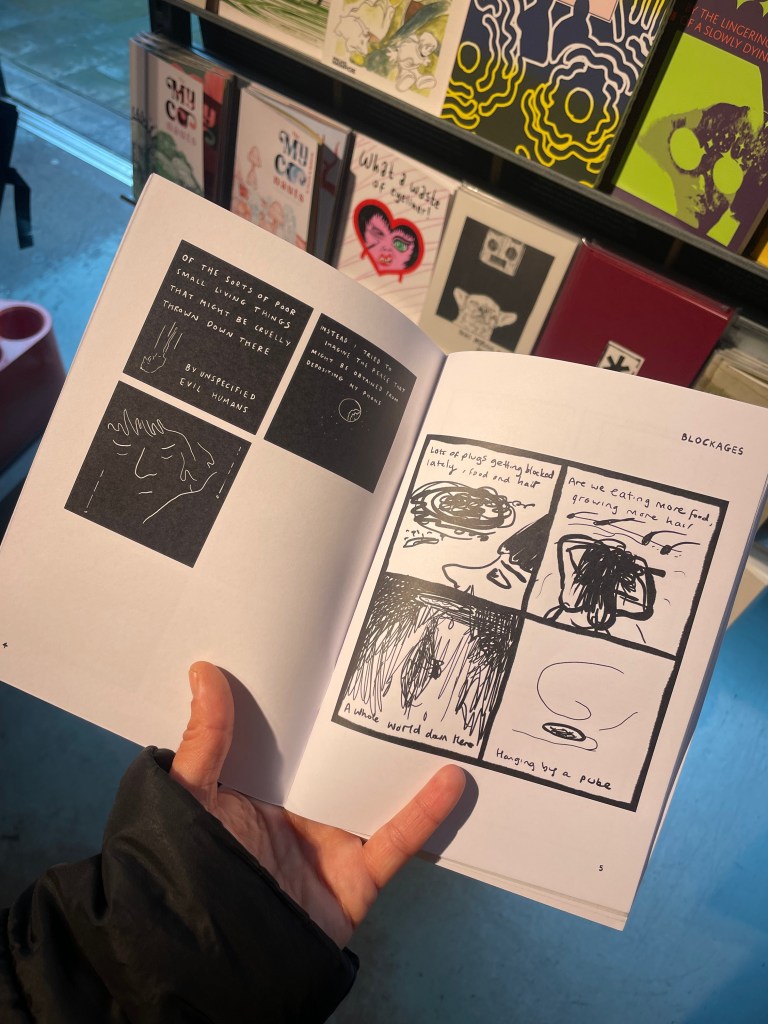
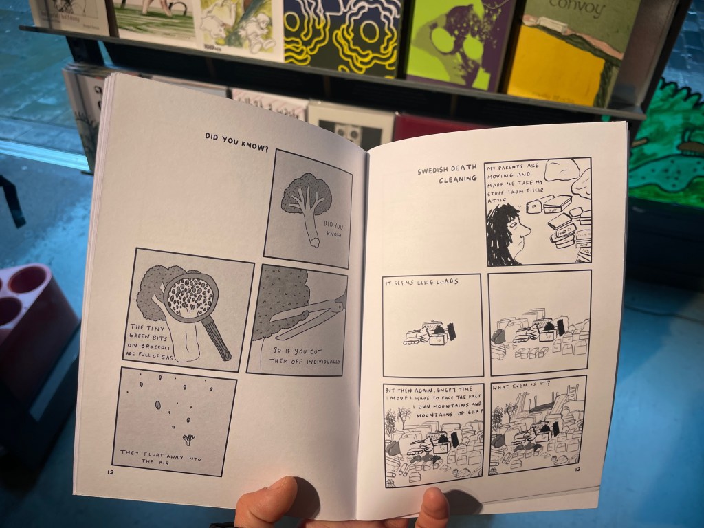
Today I visited Gosh Comics in Soho, London, to get some ideas for ways to format a potential, short, illustrated story, or even a series. At Gosh Comics they have a lot of independent comics and zines, often referred to as ‘One Shot’s if it is a stand alone comic. Many of these independent publications have minimal text accompanying hand-drawn images, and a lot of the drawings were much more experimental and expressive than I am used to seeing in mass-published graphic novels.
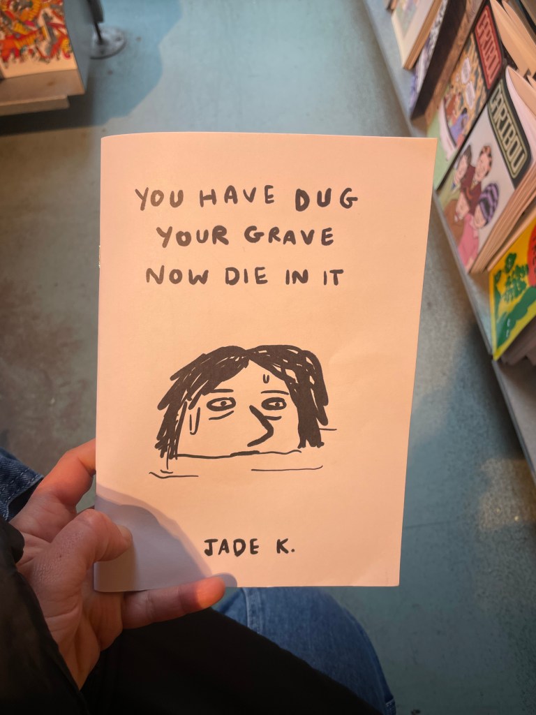
In many ways today’s trip provided positive encouragement to continue expressing myself despite personal feelings that I am not a highly skilled illustrator. I felt especially motivated by expressive artwork in a comic by artist ‘Jade K.’ Initially I was drawn to the small book because of the bold cover image in black ink, and – what I deemed to be – powerful wording. I was pleased when I saw that inside the comic the simple black and white aesthetic had been maintained.
I had gone to Gosh Comics specifically to see how some, smaller books were bound. Some were folded pieces of larger paper, which actually sparked ideas for how else I may like to arrange the original drawings I did based on the answers to my survey – to draw each of the twenty responses into a 74.25mm x 84mm box, on paper, that can be unfolded to create an A3 poster.
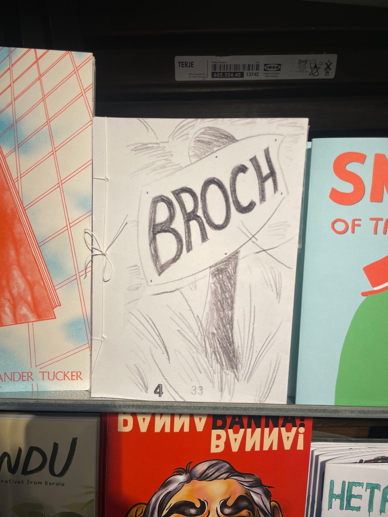
I was drawn to comics at Gosh that were interestingly bound, such as ‘BROCH’, which had visible thread holding it together. I enjoyed the hand-crafted feel to the book, and how delicate it felt to handle. This, to me, made it feel more intimate or sacred to read than a typically glued or stapled spine.
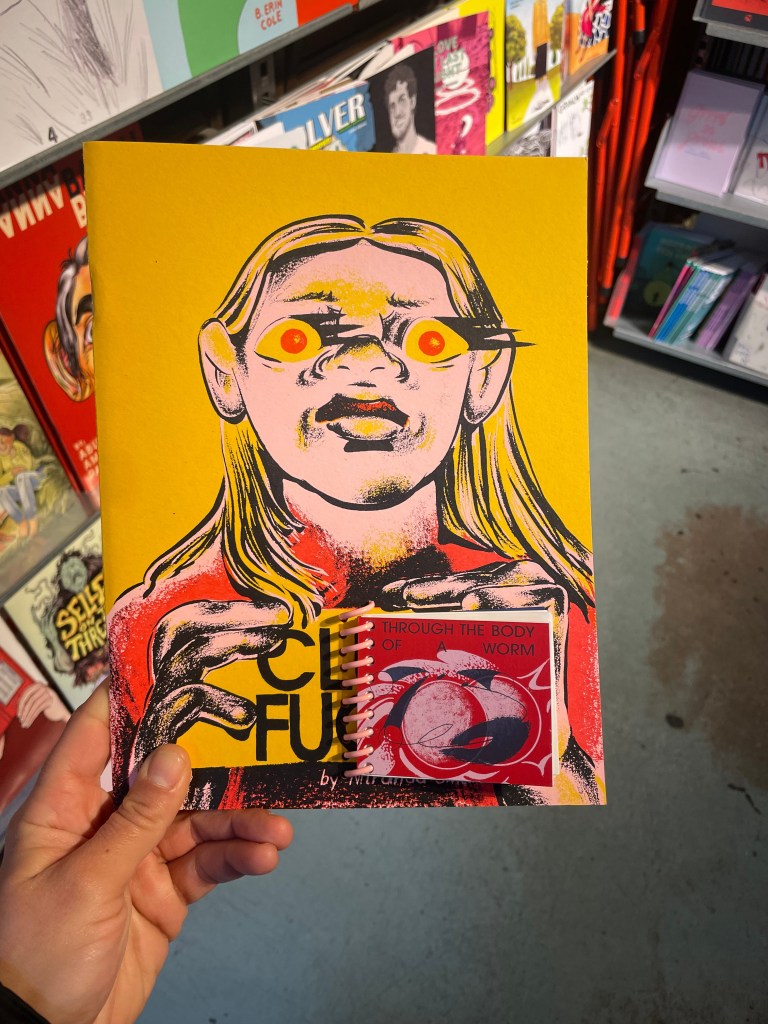
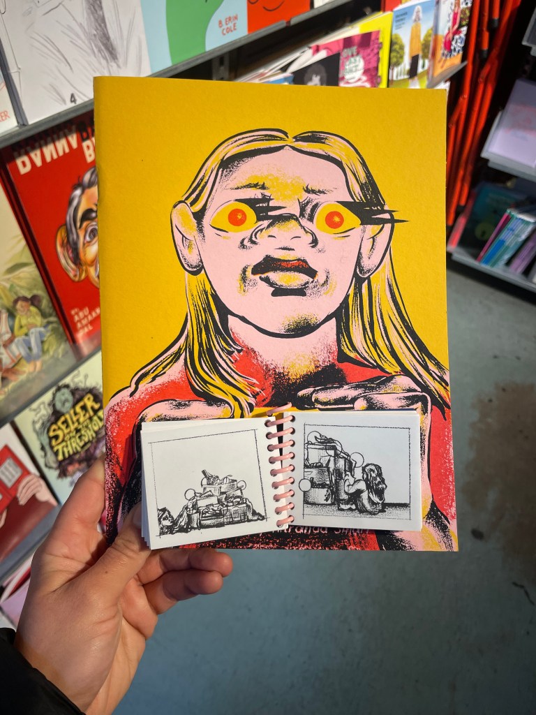
Alternatively, I really liked the addition of a smaller, second, comic that was added to the front page of another comic, and bound with a spiral, ring, spine. Perhaps in the case of my own work – I could have a smaller book, simply containing the answers I received for my survey; attached to a bigger book containing illustrated stories of the moral lessons.
Tim’s Tale
I find that writing in rhyme comes quite naturally to me, however, I was still surprised at how quickly I managed to complete the first draft of the poem. I find it easiest to get into a flow with writing as I type poems from my head into my Notes app on iPhone. My method of redrafting comes by reading and rereading poems – both out loud, and in my head, to see where there may be snags to the rhythm. Eventually, when I am happy with the content, I will type poems from my phone into a database I keep on the app Notion, in which I have over 120 poems at present. If I am drafting an intentionally longer piece, I tend to handwrite into a book first, and edit on the page – this is because I struggle to write lengthy poems on iPhone, because I find on the narrow screen text appears longer than it actually is.
I’m quite a confident writer, particularly of dialogue and poetry, and having had overall positive feedback from four people (three previously familiar with Belloc’s work) with whom I shared the story I have written, I am confident the writing works, and fits appropriately with the context of my piece – being to parody values and lessons, typically presented to children. One person described my poem as a “modern day recreation” and said it “fits excellently in that style” (referring to the somewhat formal language and abrupt ending). Another person expressed that they enjoyed the rhyming structure, and commented that it was “fun to read”.
In order to get some visual ideas in front of me, I reread the poem and drew small images into a sketchbook, to decide on the style of drawing I would be happiest with. I then moved on to inking some of these drawings, to ensure the distance between lines would be enough when adding a slightly thicker stroke of ink. I also wanted to practice using dipping ink and nibs again as it had been some time since I last did.
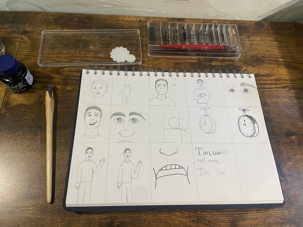
I focused mainly on Tim, as I knew that I wanted to include at least one image of the same person. As two names are mentioned in the poem, and initially I planned to include both ‘Tim’ and ‘Ben’ in my illustrations, it was necessary to ensure both characters were distinguishable from each other. One of the things I struggle with when drawing, is creating identical images – as is often needed for comic books and graphic novel drawings; so I decided quickly to scrap the idea of drawing Ben and focus on only Tim and another scene-setting illustration. I chose to focus on the clock as it was one of the images I had set in my mind. Initially the clock I pictured was decorative; the type you may see hanging in an old train station, however, when I tried to draw the four-sided clock I imagined – I realised the high level of detail may not fit with the simplistic style I was aiming for.
Reflection
I’m very happy with the look of this piece, especially the cross-hatch shading, and the deep black colour used in the illustrations and the typography. I chose the serif font ‘Baskerville’ for the poem itself as I liked the somewhat gothic and Victorian era print aesthetic. Initially I considered using a hand-written font that I created myself, called ‘Messy Boxes’ as I enjoyed the playful and more modern styling. It was because I realised how long it may take me to hand-write the poem (especially if I worked on multiple), that I decided to format the document on Adobe InDesign. Because I have decided to create this in digital format rather than a printed copy at this stage – I ran the images I had drawn through Image Trace in Adobe Illustrator, to vectorise the drawings.
Overall I received positive feedback on my work so far. It was commented by one of my peers that I have evidently put a lot of thought and work into my projects – which is true. Putting effort into the context of any piece is very important to me and as I have previously mentioned, I enjoy other people’s participation in my artwork a great deal. I asked my peers if the illustrations that accompany my story remind them of anything. I did not lead them into any suggestions, however, one person stated it reminded them of the ‘Mr Men’ book series. Although this was not one of my references in this case, I was pleased the illustrations I have drawn evoked nostalgia in someone. Another peer agreed that the simply drawn pictures were indicative of illustrated storybooks for children.
If I had more time I would definitely like to create a series of stories, which was also suggested by one of my peers in a review session. Thinking along these lines, and with some of my researched artists in mind (such as E.H Shepard), I am considering that each story could be illustrated in a different style to suit its theme. That could at least be another experiment in order to get several ideas visualised, as I consider other ways to tell the morals of my acquired stories (adapted to people’s answers from my survey).
Due to the somewhat heavier subject of some lessons learnt, I may decide to adapt the ‘series’ I would create (if I had more time) to be more suited toward an older audience, perhaps over the age of sixteen. If I did not put an age-rating on this piece I may have to consider adapting the morals of each story instead. Without context, answers to my survey such as “I learnt the evil side of religion” could be problematic as I wouldn’t want to unfairly portray any religion, person, or culture, or place anyone under scrutiny for my work, as in this case my focus is not political. I therefore feel I have to be cautious when considering whose views I am presenting with each story.
