As an exercise in the studio, we were to think of different ways to present colour within our projects, or what we are working on so far. At this point I am considering memory relating to news articles, and pop-culture references from my youth, specifically at this point, the year 2000.
I decided to consolidate news articles from the year 2000, from the BBC webpage ‘On This Day‘. I then organised each article by colour-coding them.
Red = murder
Green = environmental
Blue = finance
Yellow = arts and culture
I spent some time working out how many articles were displayed on the website, and how to evenly distribute these as a grid. Seventy-one, however, doesn’t fit into an even grid and so I added the extra date on at the end to indicate direction in which the colours should be noted (left to right, top to bottom). I found the outcome to look a little like a monthly calendar spread that one may commonly come across and this pleased me. I find calendars and other organisational structures/ formats very satisfying to look at.
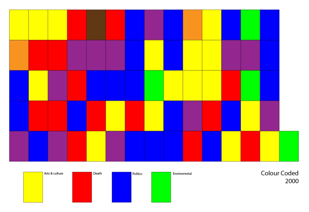
I enjoy the visual outcome and ambiguity of this piece, which I have titled Colour Code 2000. A lot of the news stories I referenced throughout the year 2000 included articles about people dying – from wars, in storms, murders, and various other ways. Yet looking at the piece I have created, it removes all information, and emotion (except for the use of some colours, such as red which can often connote danger, importance, etc), and presents simply the fact that death was involved in an article on this date. It removes empathy and understanding but perhaps in place inserts curiosity.
Articles that covered more than one ‘category’ of news are a blended colour – for example, an article from 11th January 2000 discusses the deaths of seven men in a storm at sea. I classified this as covering both ‘environmental’ (green) and ‘death’ (red), and so the colour displayed for this day is brown.
I also considered ways in which colours are viewed as I created this piece. Red often highlights danger, or a warning and so it felt fitting that this should be the colour for (in my own opinion) the worst type of news – death. Blue to many represents calm, something regal, or loyalty… to me it represents ‘Barclays Bank’, for better or worse, and so it was my personal choice to represent financial affairs which then, narrowed down or simplified became ‘politics’. I didn’t want to spend a long time deciding on what shades or hues of each colour would work best, as I felt this would entirely detract from the point that I am aiming to remove empathy and emotion around the articles by simplifying them to representative colours, and so I selected the default colours available for my selections on Adobe Illustrator’s default colour swatches. I then, as an outcome, really enjoy the vibrant, bold colours that feel unnatural to look at – again removing a human element that I believe most people engage in the news with.
I have decided for the ‘Re-inventing the Colour Wheel’ outcome, to include the colour-code as I feel that by answering questions viewers may have around the colours’ meaning, it highlights a lack of empathy expressed through the piece, and the way I have generalised and summarised articles based on how I personally would classify them. For example, a lot of articles from the year 2000 that I came across related to the at-the-time Prime Minister Tony Blair. Not all of these articles were, in my opinion, worthy of front page status – some being about ‘scandal’ and events within the Blair household – over global and national news stories that reference atrocities such as war and poverty.
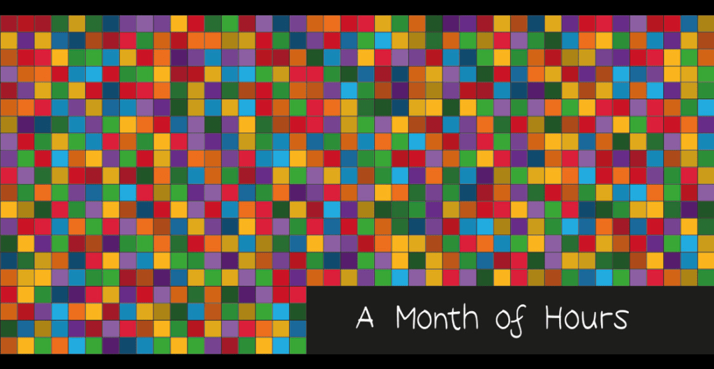
This project was inspired, in part, by something I had previously created, for which I created a sort of colour chart of things I thought about, hour to hour, in one month in 2021. The title of the piece is written on the work itself to aid the viewer in understanding the value of each square (being one hour). I called the work ‘A Month of Hours’. Each colour represents a different topic and varying shades of that colour show the intensity at which I was feeling or thinking on the topic. With that project I decided to withhold the colour-code information, so that I could keep some anonymity over my own thoughts. Now, however, I wish in some ways I could remember or reflect on what I previously spent so much time thinking about and that I therefore had kept some reference or code. However, by withholding this information, I have made the piece potentially timeless, and not bound to be understood by me only as everyone has their own changing thoughts that run over in their minds.