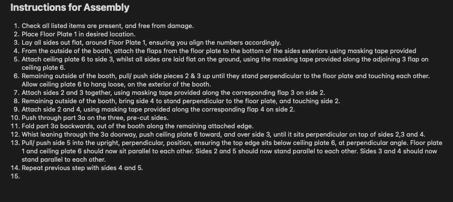
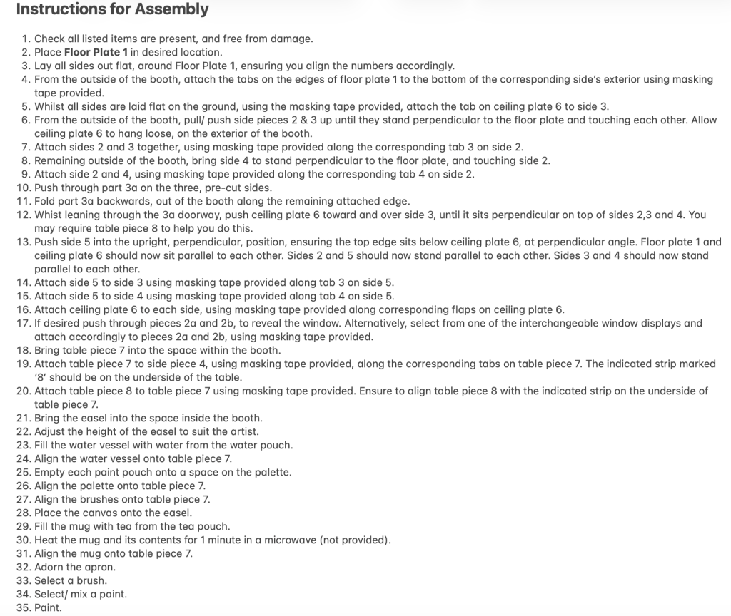
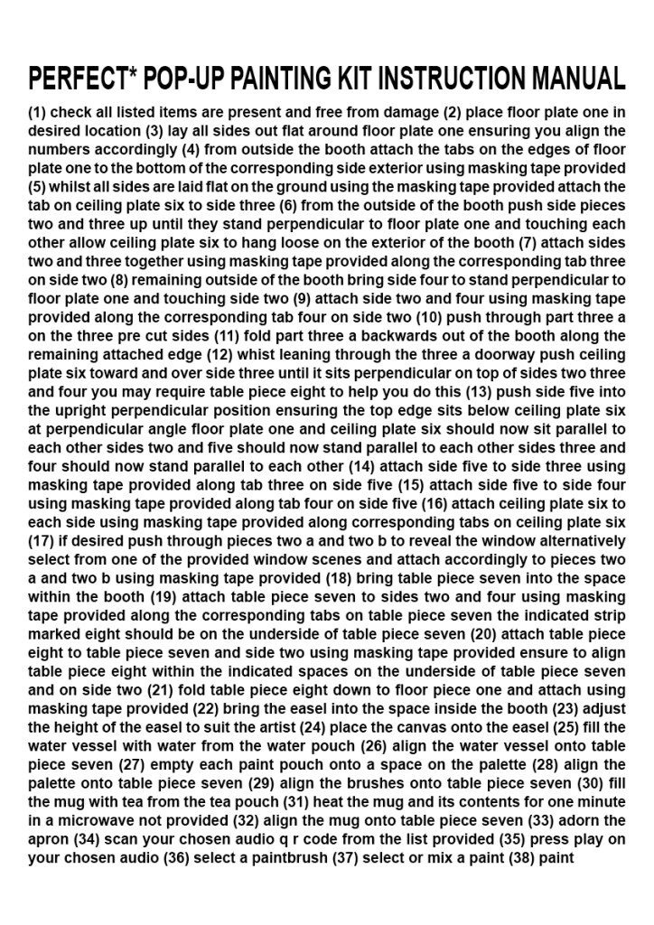
The Project
Following on from my tutor’s suggestion that it would be interesting to see my painting preparation steps in a full-list format, I decided to create a series of step-by-step instructions, detailing each moment including the assembling of a pop-up painting booth. This was the first next stage of my process, and to compile the list itself I used the Notes app on my iPhone (I find this app very useful as it shares stored data across the cloud, and can be accessed from my different devices). The list took a while to draft, and redraft, and redraft again. In truth, I lost count of how many versions there were that I initially thought were complete, before realising I’d left off another step.
Reflection
Looking at what I have so far created as part of my work for my ‘Perfect Painting Space’, I feel pleased with the visual outcome. It was quite time consuming to create a correctly worded document in such detail, and took a lot of rewriting in various stages as I simultaneously drew plans for the space. I found this a useful way of getting the work done on this project, as so much of what I have considered so far has been logistical placement and the order of instructions.
As well as enjoying the process of formatting using Adobe InDesign, I like the dense mass of aesthetically overwhelming text achieved in my eventual outcome for the ‘Instruction Manual’. I like the typography for its simplicity, and the classic but strong Sans Serif font I used (Arial, Bold). I wanted to create a ‘document’ that in part has similarities to any typical instruction manual, however amplifies the complicated nature of the information given, by overcrowding the page and including no punctuation.
Having used Adobe InDesign previously meant I began with an understanding of how to change the leading and kerning on highlighted text. Before I created the, initially A3, document I had a vision of crowding the page with eligible but difficult to read text, however, I did experiment with a few other alternatives in a new, copied document. The eventual size of document I decided on was A4, as I felt this would be more in-keeping with a standard instruction manual, and I liked the placement of the final two steps more in the format I worked on adjusting for an A4 size.
I chose to keep the step numbers included, as I feel some digits within brackets appear to break up the text nicely. I also wanted to emphasise the number of steps that I have listed for the ‘preparation’ process. Early on in the project I knew I wanted to end with the instruction to ‘paint’ – as though this is literally as far into the process as I am able to guide anyone. “The preparation stages for me are thus, the outcome is still down to you.”
I enjoyed adding small elements of humour to the overall idea, for example making an overly complicated instructions manual at all, or particularly step 31 – “heat the mug and its contents for one minute in a microwave not provided”. The stating of a microwave not being provided, at the end of such an extensive step list feels somewhat of a relief/ cop out from the designer (myself), as if I am just trying to wrap up the steps by that point – perhaps even because I am at this point visually coming to the end of a singular A4 page.
