It strikes me that this ‘walking artist’ documents his experiences of walks/ walking, in various ways, perhaps according to what feels right for him personally; remembering details in aspects of what is created, perhaps beyond what the viewer may see.
I looked at the work of Hamish Fulton during Unit 1, when I was placed into the ‘earth’ group for Hat Day, and subsequently looked at ‘land artists’. I was at the time struck by the different mediums of display the individual artist chooses to work with, and I admire the somewhat limitless approach. I often feel I have several ideas for any one particular project aiming to convey a meaning or symbolic message. For example wishing to express my ideas textually, audibly, to include tactile elements, as well as impressive visuals. I’m often daydreaming of how to create a full experience for an audience – likely because of my own background in theatre, and particularly my training in devising immersive theatre.
Contradictory as it may seem – when I look at the, at points, seemingly simple work, I feel I am looking at Hamish Fulton’s own detailed descriptions of what he experiences as he embarks on, what I imagine to be, a cathartic process of solo walking.
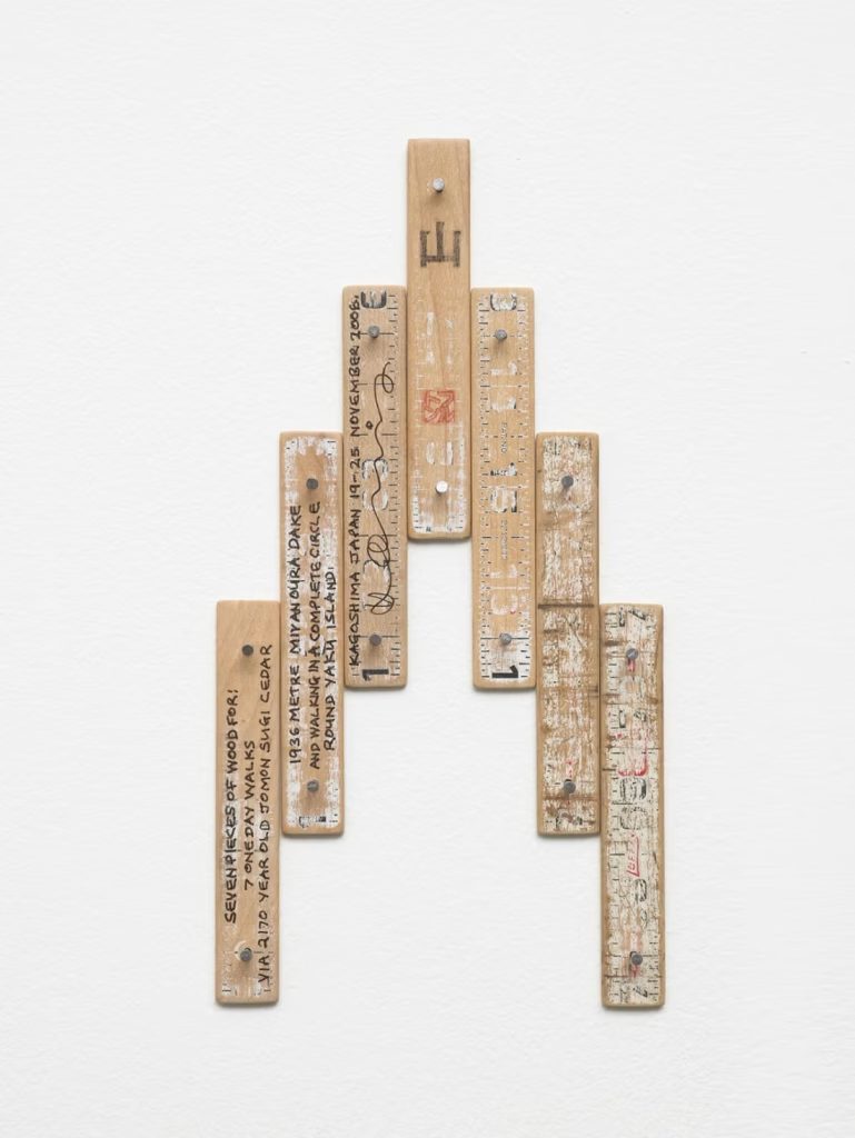
I particularly like 7 pieces of wood. Mont Blanc. France Italy. 2009 – as I also have an interest in woodwork, and wood-based art. I feel this piece by Hamish Fulton looks to have an experience literally carved into it. It feels as though the items would’ve been carried around with the artist, but are now together forming another purpose that was previously unforeseen on the walk itself. The wooden pieces look like they have been arranged into a landscape that was maybe viewable to the artist as he walked. Or maybe that the hillside was felt literally as he walked across it, and the steepness of the hills seems to me reflected but exaggerated in the work as it connects together. It would be interesting to see this work in person, and note how I feel in relation to it when it’s placed on a wall, perhaps at eye level common in galleries.
I also like the simplicity of colour in Fulton’s work. Mostly, not more than three colours are used in any one piece and yet the work appears bold and striking to my eyes. I admire the typography in much of the work – I am also visually interested in typography, and the eye for detail that goes into ensuring factors such as leading, justification, and kerning are on point.


