Website Notes
Dean Kenning’s website, to me, appears very simplistic, relying on the showcased work to draw the audience in to each project from just a title and a cover image.
The website itself looks archival, and specific in a visual content that I, personally, wouldn’t be particularly drawn to perusing further, had I not been recommended to look through Kenning’s work as research material.
Personally, I’m not a fan of the specific thumbnail images that have been used on the website as the chosen cover photos for each project. I appreciate the amount of available information on most project pages, however the website itself as a visual archive – doesn’t much inspire me, and I find the individual webpages to appear gappy, and as one, long, scrolling block. I think I feel more focused and inclined to keep reading/ looking when the pages themselves are visually stimulating, and/ or interactive to a degree.
It does strike me though that Kenning is incredibly submersed in the contexts of his work, and this shows through the details listed under each project, and the various forms of documentation.
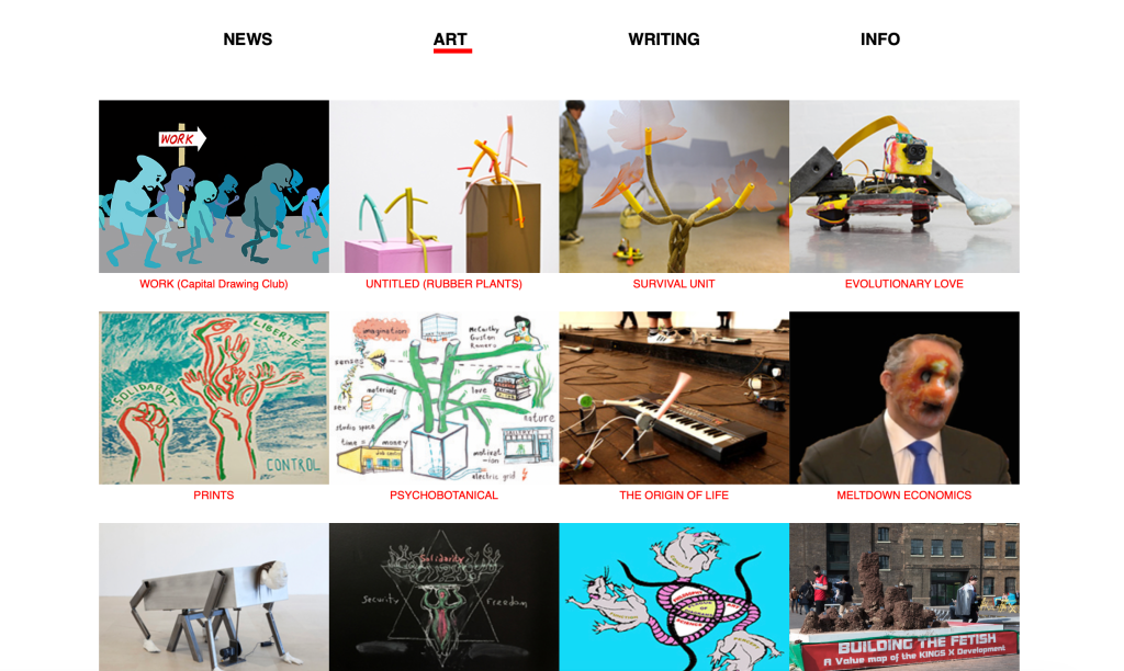
Diagram Art
I admire the documentation processes that Dean Kenning displays as aspects of the work, as I enjoy learning about other people’s processes, and ritualistic practices. To be able to get insight into an artist or designer’s processes feels to me like being introduced to the Magic Circle, and I really like the various types of medium (video, illustration, collage, photography, text, etc) that is used throughout the website. It feels very thorough in documentation of work, and clearly Kenning enjoys exploring multiple creative disciplines, as do I. I find this aspect of the website encouraging, in the sense that I feel more motivated to create for, and based on context of a work, rather than feeling limited to a particular style or discipline.
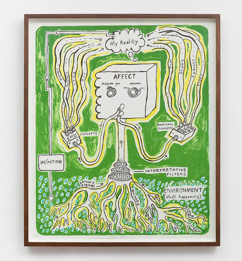
These images are some of my favourite diagrams/ documentation displays on the artist’s website. I enjoy the sketch-like doodle, and the green background in Evolutionary Love, particularly in contrast/ combination with the black text and outlining, and the white space within the strange, robotic looking creature.
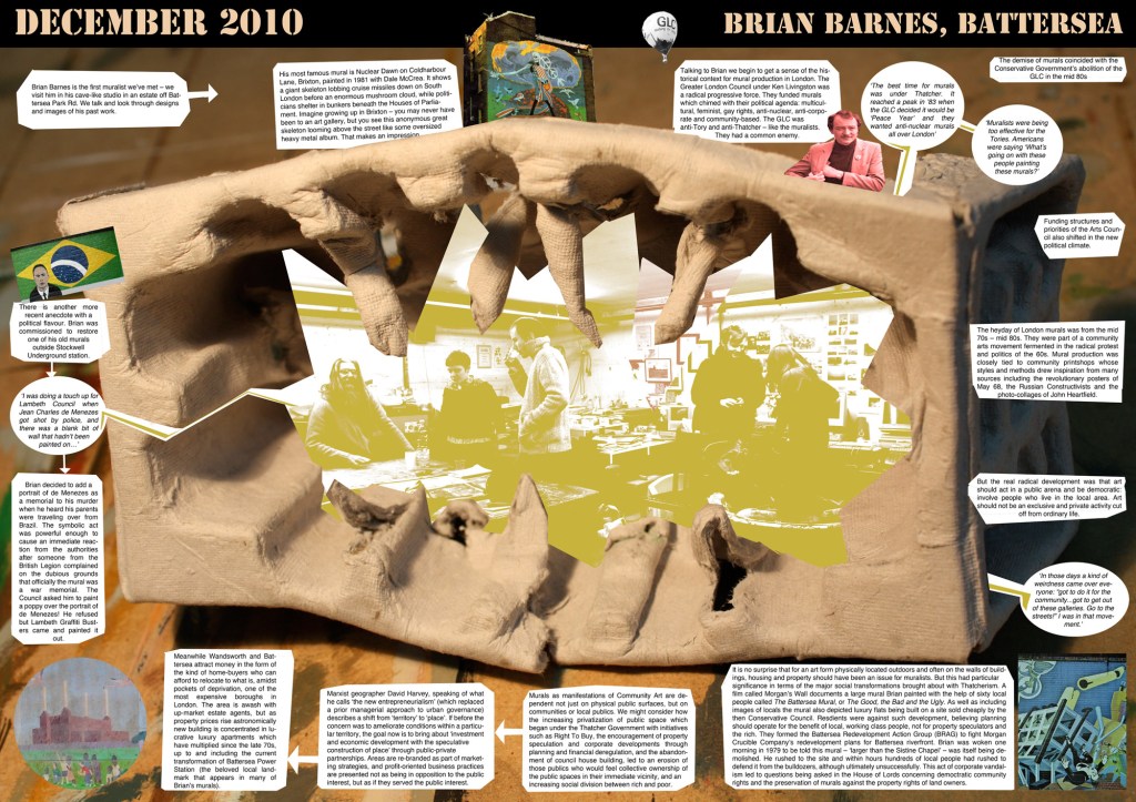
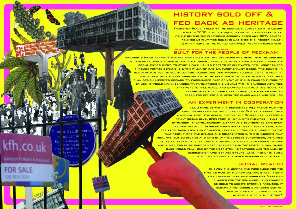
I also have discovered even more of a love and appreciation for collaging since I have recently (whilst researching illustration techniques) seen so many artists using it to create striking compositions, and for this reason and the social-political-environmental context of the poster itself – I wanted to include The Peckham Experiment.
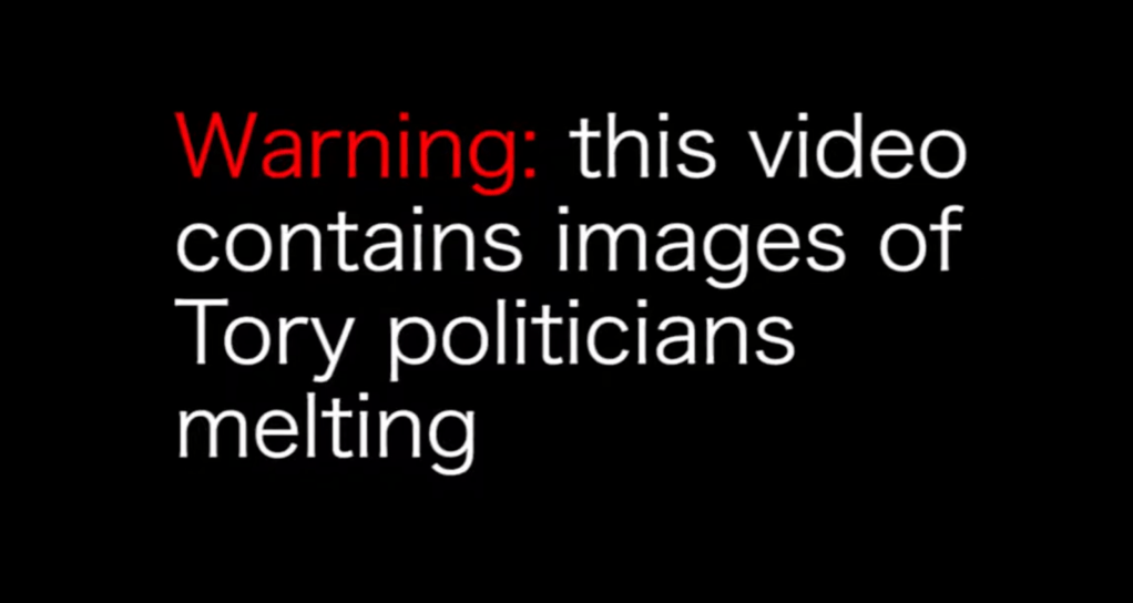
Meltdown Economics
Despite often struggling with focusing my attention on most videos, films, and television programs, I’m beginning to enjoy video art forms a lot more. I can certainly appreciate the level of time and skill that goes into editing footage, and this is something I enjoy the process of myself, despite the time-consuming nature of the activity. For the purposes of challenging my own attention span, research, and honing my personal interests in art – I decided to watch Dean Kenning’s video work Meltdown Economics.
The video itself sort-of grew on me (evidently quite quickly, as it’s only 4 minutes long) as a concept, especially as each ‘scene’ would begin and Tory politicians faces appeared on the screen – I felt an eventual expectation of the melting face effect Kenning has applied. In this way it became quite captivating, as I wondered what the inside of their head would melt down to look like. It was certainly a bizarre enough concept, but I enjoyed the surrealist nature of melting unfavourable political figures as they spouted their controversial statements and opinions (…digitally).
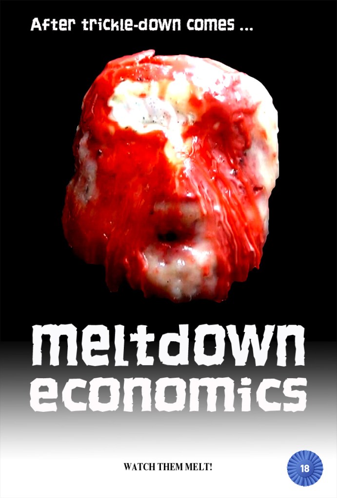
I also like the moments of somewhat eerie silence at the beginning of each new clip, as the next politician to be featured’d name is introduced onto the screen in a spinning blue rosette, which the movement and transitioning of, I personally consider quite a cheap – tacky effect, and usually associate slide transitions with a boring/ underdeveloped presentation. On reflection, I admire this part of the video’s humour, and also consider the moments of silence quite humorous as the work progresses.
I’m not exactly sure why; again I put it down to the reasonably satisfying expectation the viewer takes on once the concept/ format of each clip is established – there is silence as the politician about to feature’s name appears on the screen. Then they themselves appear, in front of a blacked-out background. In most of the clips, there is silence before they begin to speak; as they do – their faces start to ‘melt’ in a few stages, by use of video effects. Once the faces look as though they’ve been melted down to the skulls, the remark being made by the politician is quite abruptly cut off, and the next politician’s rosette-spinning segment begins.
There could be probable controversy caused by work of political context, especially for people who vote, experience, and think differently to myself, and (one can presume – ) the creator of this work – Dean Kenning, also. I like that Kenning has not shied away from making statements, even if they are seemingly quite absurdist in their approach.
As I say, to watch and listen to, it feels humorous, and quite ridiculous, as well as somewhat grotesque – an opinion that many people can likely identify with generally when to listening to politicians; regardless of the melting-face effect.
I like Kenning’s decision to only include the political figures’ voices, because ultimately they’re the ones we’re tuned in for – the ones with the power that, unfortunately, seems to matter most in modern times. Although I wondered at first, what proposed issues the politicians were addressing in their comments, this is not where my interest and focus remained. I just wanted to see the satisfying visual effects of each face melting, and I noticed that the beginning of the clips seemed to speed up, or the initial silences were cut down as they progressed through the 5-segment series. This felt natural and added to the reasonably sadistic excitement I felt, like “yeah yeah, rosette spinning – hurry up and melt Michael Gove’s face down to the bone!” – again, I’m speaking about digital, video effects – you understand.